|
ABSTRACT
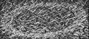
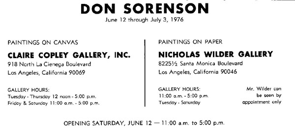
IMPRESSIONISM TRIUMPHS As the summer season begins with group shows in most galleries, two extraordinary solo shows end the season on Santa Monica Boulevard. The James Corcoran Gallery offers an unusual opportunity to see paintings, drawings and sculpture by master abstract expressionist Williem De Kooning. Next door, the Nicholas Wilder Gallery presents young abstract expressionist Don Sorenson in his second solo show at that gallery. Both shows were extended an extra week to July 10. (A tandem show of smaller works by Sorenson occurred simultaneously at the nearby Claire Copley Gallery on La Cienega Boulevard. Sorenson's large unstretched paintings are not overshadowed by being shown in close proximity to a master. Rather, Los Angeles art viewers benefit from the opportunity to compare a first generation's abstract expressionist's work with that of young contemporary expressionist. Sorenson's work represents a current concern os several young (early twenties to early thirties) Los Angeles artists who are utilizing the free aesthetic spirit of the seventies to re-explore earlier concerns associated with the fifties such as abstract expressionist painting. Sorenson's paintings differ most from De Kooning's in that they are composed of heavy strips of of taped which have been painted, intertwined and affixed in a collage manner to a heavy paper backing— which is then attached directly to the wall with nails, rather than being on stretched canvas. He shares with De Kooning a concern for the broad, forceful single brush stroke which which exists in a gestural shape. These single colored strokes weave in and out of space, sometimes coming forward then mysteriously dipping under, bending back into space behind the picture plane. In Sorenson's work they interact and sometimes contradict, in their more curvilinear moments, the structure already established by the jutting, diagonal painted strips. Sorenson's paintings utilize the more all-over composition developed by Jackson Pollack, while De Kooning's compositions are more divisible into underlying larger forms: however some of Sorenson's works retain a vestige of second, smaller, irregularly shaped rectangle contained, usually at a slight angle within the first. Sorenson's seven large paintings, all horizontal except one, are decidedly longer one way than the other, while De Kooning's are closer in proportion to a square. In addition to hid obvious capabilities with structure and paint handling, Sorenson's strongest feature is and unusual color sense. His largest painting, and impressive 10.5 by 8 feet, combines brownish rose and light and dark blue brush marks with maroon, rose and yellow paint strips. This painting also contains the most pronounced central form and may be the earliest in show, as the central form was the most notable feature of his solo show last year. Another striking unusual color combination is a 5' by 8 ' painting with bluish purple and yellow-rose brush marks and peach, gray-maroon, gray-chartreuse and pale yellow paint strips. This painting has the least suggestion of a central a central form and may be the most recent. These are not colors one would expect to encounter together. Yet, as in music, experienced all at once, they strike a strangely appealing minor chord that enable them to exist together in a unifying glow. Williem De Kooning's show concentrates on his recent bronze sculpture (1973), with three recent oil paintings (1975) a several related color drawings from the fifties. The even, very dark brown patina of the sculpture presents visually more than as a humorous, gestural silhouette, rather than a solid volume. The surface is similarly gestural and expressionistic. The figures are related to Giacometti while the heads recall Matisse. Most impressive are the three paintings, especially the two largest. They invite long, solitary study and contemplation. It felt good again to see paint so concerned with being paint, so obviously hand-brushed, the surface allowed to congeal and thicken in clumps and wrinkles as it dried! Some may say, "Why repeat the fifties?" But to me these do not look exactly like the fifties. They look fresh and new— these two paintings represented some of my most satisfying art experiences in June and July. I paid them several visits: some were for pure enjoyment, some to try to discover the secret of their creation. I followed the deep, blue-rose two inch thick gestural line-shape that dominates the large of the two paintings, "Whose Name Was Writ in Water," 77" x 88". Though seemingly made in single, continuous motion, it weaves in and out, sometimes on top of the other shapes, then dipping underneath, then mingling in areas to become a larger form. I explored the pale Naples yellow of the second predominately blue-green and gray painting ("Two Trees of Mary Street, Amen," 80" x 70"), as it moves into deep space near the upper center of the painting, then comes forcefully forward just left of that area. It is endlessly intriguing that a single color can take on so many forms. I never learned fifties painting in the fifties. Perhaps that partially explains its compelling fascination for me (and for today's young artists) but I also think it has some of the same eternally fascinating qualities in its controlled use of accidents and nonrepresentational forms that Leonardo mused upon in stains on old walls in the Renaissance, then utilized as the catalyst for his landscape backgrounds: "If you look at walls covered with many stains... with the idea of imaging some scene, you will see in it a similarity to landscapes... battles and figures... and an infinity of things which you can reduce to separate and complete forms." Leonardo da Vinci, The Painter's Activity. "Memory and Attention, " no. 349. c. 1490. Martha
Alf
|